Paperlane

Client:
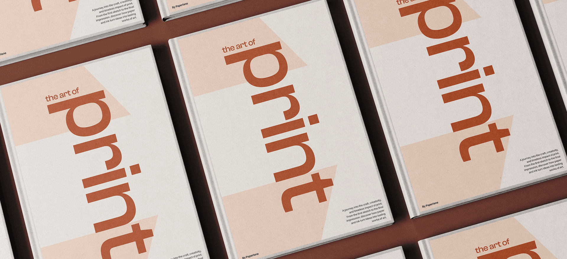
Paperlane
Year:
2025
Type:
Strategy, Branding
A premium print shop built for brands and creators who value craft. Focused on quality, precision, and timeless design, Paperlane turns every print into something worth remembering.
The Paperlane logo blends a bold P with two lane shapes, a clear reference to the brand’s name. It delivers a clean, precise, and timeless look — perfectly aligned with Paperlane’s vision. The lane forms are reused across other brand assets, creating a strong, consistent visual system that ties every touchpoint together.